Roots 2018
TitleRoots 2018
AMSTERDAM ROOTS FESTIVAL
Very proud that I can call myself the campaign designer for the Amsterdam Roots Festival for the coming years!
The Amsterdam Roots Festival has been around as long as I can remember and is THE festival in Amsterdam to get to know music from all corners of the world.
The organisation is situated in the same area as I live ( and spent my whole life actually) so it feels like a home game to me.
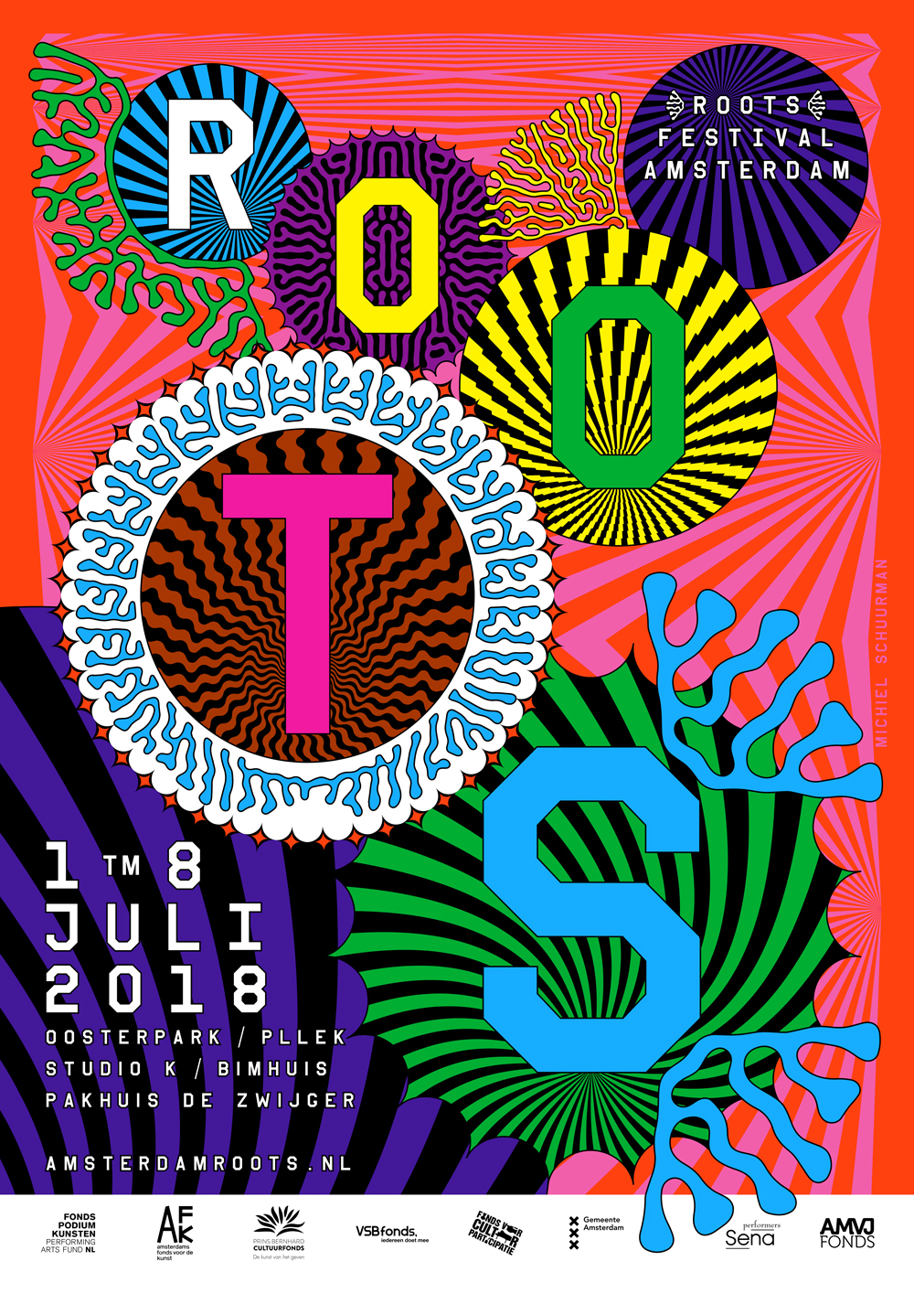
THE DESIGN
Thinking about the design of this festival is challenging. You can't be too specific in your references. The festival features a lot of different aspects of music and cultures. Focussing on only part of the story means you will exclude other interesting parts.
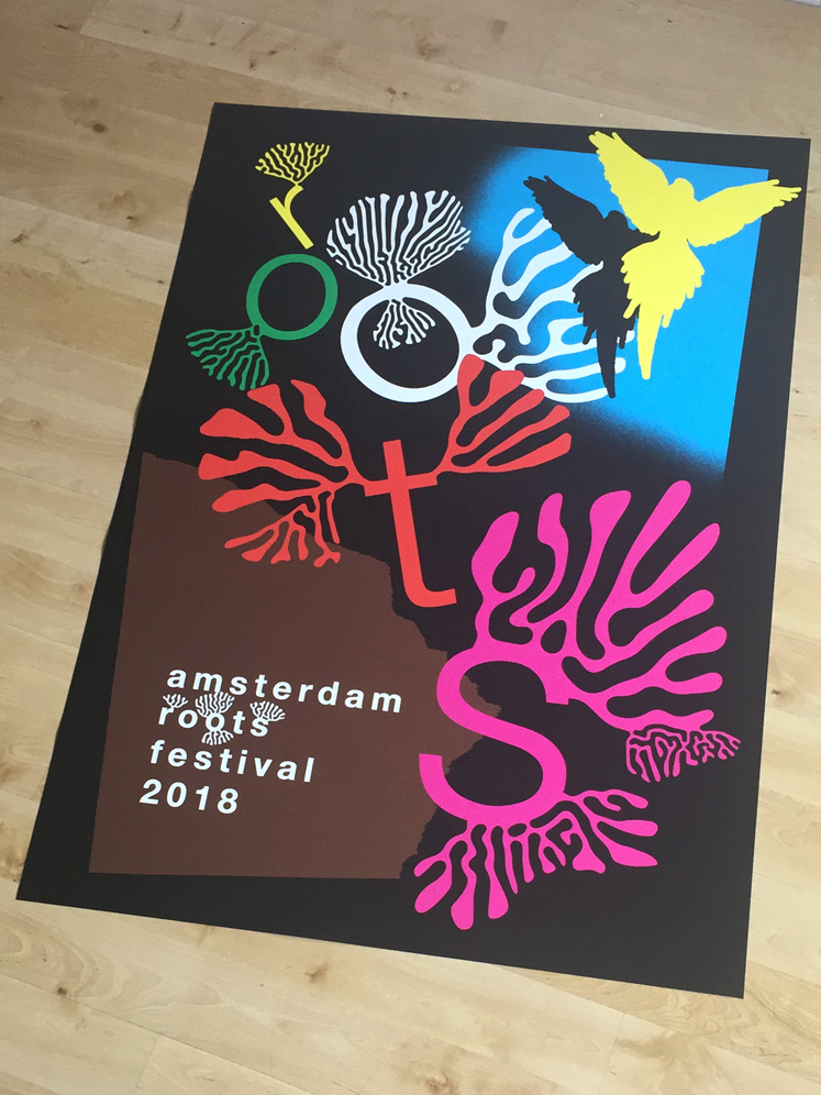
The campaign image looks very varied on first sight. A lot of colours, circles and typography of varying sizes and different ideas of embellishments are all competing for space.
A lot of variety will easily derail if you're not careful so I applied some 'laws' to the elements.
-One of these laws is that every circle has a connection with a coral-like element. These corals are formed by an algorithm known as a 'Turing pattern'. This Turing pattern is a model that can be used to make a lot of patterns that can be found in nature. For me this was the ideal start to visualize the name of the organisation. It is very easy to create root-like structures with this algorithm as you can see in these early sketches:
Very proud that I can call myself the campaign designer for the Amsterdam Roots Festival for the coming years!
The Amsterdam Roots Festival has been around as long as I can remember and is THE festival in Amsterdam to get to know music from all corners of the world.
The organisation is situated in the same area as I live ( and spent my whole life actually) so it feels like a home game to me.
THE DESIGN
Thinking about the design of this festival is challenging. You can't be too specific in your references. The festival features a lot of different aspects of music and cultures. Focussing on only part of the story means you will exclude other interesting parts.
The campaign image looks very varied on first sight. A lot of colours, circles and typography of varying sizes and different ideas of embellishments are all competing for space.
A lot of variety will easily derail if you're not careful so I applied some 'laws' to the elements.
-One of these laws is that every circle has a connection with a coral-like element. These corals are formed by an algorithm known as a 'Turing pattern'. This Turing pattern is a model that can be used to make a lot of patterns that can be found in nature. For me this was the ideal start to visualize the name of the organisation. It is very easy to create root-like structures with this algorithm as you can see in these early sketches:


FINAL DESIGN
I was very surprised that some of my Turing experiments started to look like written language (as can been seen in the blue elements surrounding the 'T'). I was very happy with this because it allowed me to symbolise the cultural aspect of the festival in a way that's not excluding any of the writing systems of the world.
I was very surprised that some of my Turing experiments started to look like written language (as can been seen in the blue elements surrounding the 'T'). I was very happy with this because it allowed me to symbolise the cultural aspect of the festival in a way that's not excluding any of the writing systems of the world.
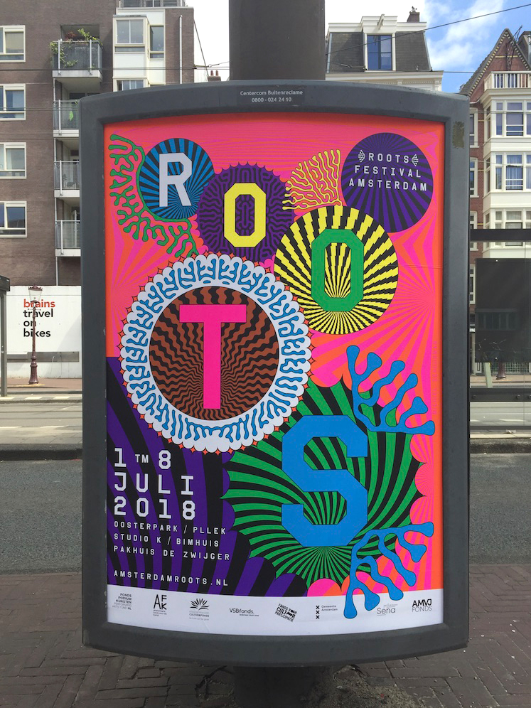


The rest of the poster is just making sure that all colours are bumping into each other in a pleasant way and that all the elements are falling and scattered in harmony.
THE LOGO
It was relatively easy to cook down all these design decisions into a clear logo. I didn't change the typeface they where already using (no expensive rebranding... throwing all old envelopes and such away). I just set the type differently. A lot of spacing for a more elegant look and I included the two 'coral' elements as some sort of mascot or visual sublogo.
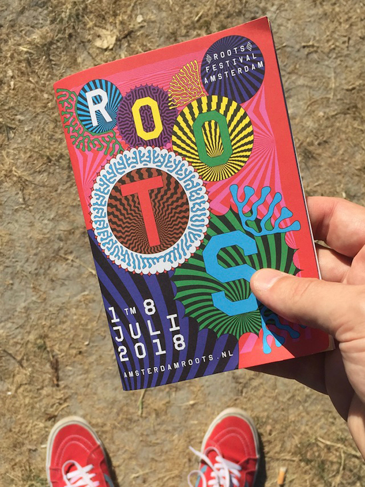
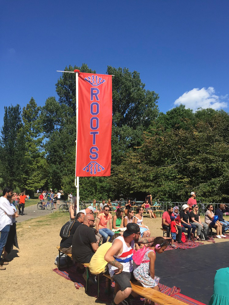
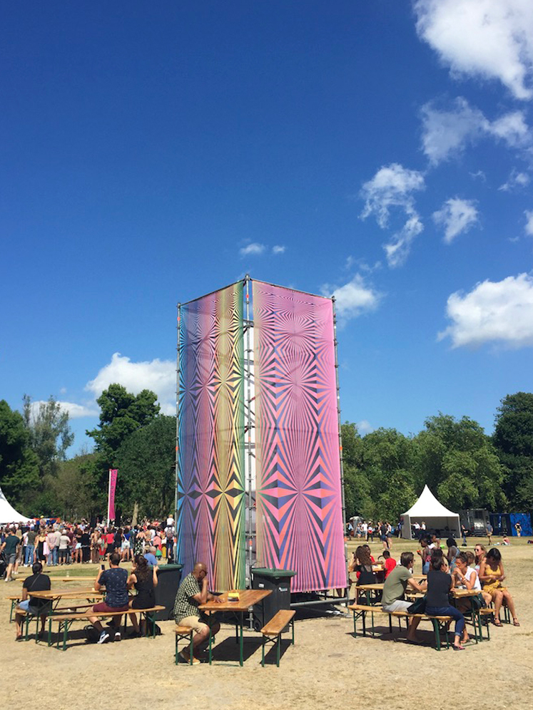
OTHER STUFF
Of course I made a lot of other stuff... Digital images, flyers, booklets, flags and so on. Here are some small examples: