THE FRUSTRATION JOY OF SCREEN PRINTING
I just thought it would be nice to share some of my screen printing tips and tricks with you.
There's no comment section but please do not hesitate to send me remarks, tips or poems at michiel@ixopusada.com
DISCLAIMERS EVERYWHERE!
Ok just to be clear on this... there are many, many techniques and some of what I do will undoubtedly contradict how you've learned it. This is just my view on a possible workflow and most of the stuff I do tend to go horribly wrong once in a while too so no guaranties here m'kay?!
I also want to make clear that this is not a 'HOW TO'. You should know a fair bit about screen printing for this page to be helpful with your work.
MATERIALS
These are the materials I use unless listed otherwise:
INKS Water based inks on acrylic base for paper. My brand is Unico from Belgium but I've seen great results with regular acrylic paint. I never use oil-based or UV inks!
PAPER can be tricky. I use 300 gr/m2(!) 50cm by 70cm paper called 'MAXI GLOSS'. The gloss finish allows me to save on inks (the paper doesn't suck) and the heavy weight of the paper makes sure that the posters won't get mangled during distribution. I buy my paper cheap at the factory and make sure it's usable for water based inks.
MESH Most of the time I use my three 120T screens for my posters. Sometimes I use a coarser mesh (40T) when I print 'metallic' inks such as gold or silver.
SQUEEGEE You'll need a sharp edged hard squeegee if you want to make detailed prints. Mine's too soft..
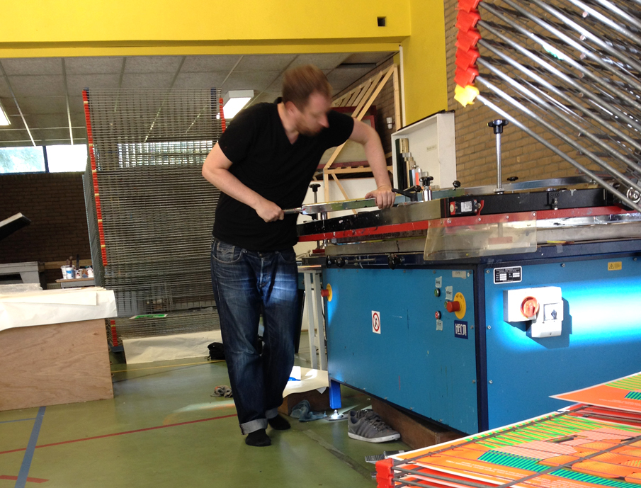
TABLE I use the table which is available but I prefer the bigger pneumatic tables. I always use the squeegee-boom! Printing directly by hand doesn't work when you need to do 300 runs a day. I also hate variations in my printing work so I always use the boom.
Since I'm quite long I'm also a 'pusher' instead of a 'puller'. Pulling the boom should only be used by smaller people.

It's kinda strange to start this page of with a technique that I only just started but I did some research on it and it feels good to share what I know with you because there's a lot of contradicting ideas on the internet about this.
Also most of the information online is for T-shirt printing anyway so here goes:
HALFTONE RASTERS
Let me start of by saying that screen printing halftone rasters is an absolute pain in the ass! You will only have a limited amount of control on your results. This is because of the following reasons:
-The mesh with which you print is FLEXIBLE. This is contradicting the attention you should give on avoiding MOIRÉ with all these fine overlapping rows of points.
THE ONLY THING YOU CAN DO ABOUT THIS IS TO MAKE SURE THAT YOU HAVE THE LOWEST SNAP-OFF YOU CAN AFFORD
The lower the snap-off, the less you warp your mesh.
-Another reason why you should be very, very warned about printing with halftone rasters is that the mesh is in itself a raster too. So not only do you have to worry about moiré between your color layers but also about the mesh itself and your color layers. This is solved by giving all your layers distinct angles but moiré will always occur.
Because of these moiré issues you can not print with very fine rasters. That's why screen printed full color photo's always look so coarse.
So why use it then? If done well you can achieve smooth gradients between your colors without having to resort to the fairly uncontrollable IRIS PRINTING technique. It also gives a specific texture to your prints and when exaggerated can be used to make Roy Liechtenstein pop arty stuff
LPI & DPI & MESH
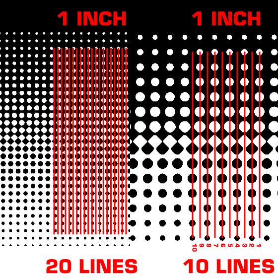
Working with rasters means you have to know a little bit about lines per inch and dots per inch. LPI basically lets you manipulate the AMOUNT of dots that you are using in your raster while the DPI determines how well pronounced those dots are. In general you have to pay special attention to your LPI and keep your DPI fairly high.
Here you see the difference between 20 and 10 LPI. Basically twice as much dots on the 20 LPI which means the dots are also smaller because they have to fit the same inch. A high LPI makes for smooth gradients BUT they will be harder to print correctly.
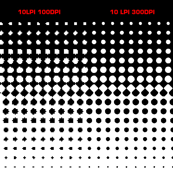
Here you see two rasters of 10LPI but with different DPIs. The difference is not as pronounced as the difference in LPI. That's why you can get away with any any fairly high DPI (150 dpi will be just fine in most cases).
MESH
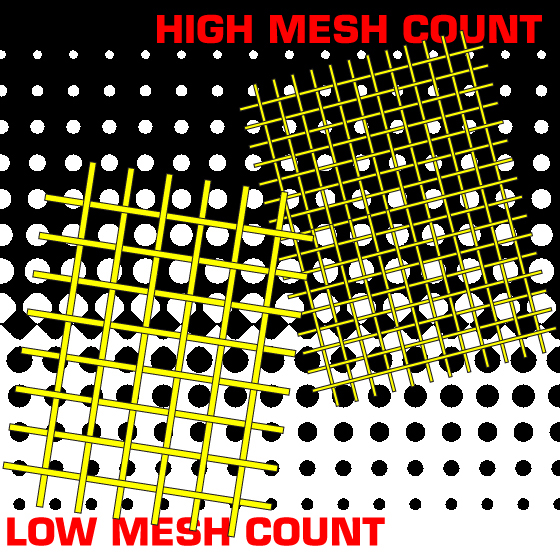
Ok so another important factor to all this math is the number of your mesh. For now it's sufficient to know that a higher mesh number is used for printing fine lines and higher LPIs. A low mesh count will only work with coarser rasters with lower LPIs.
Here so see to different mesh counts... the higher numbered mesh will hold more of the smallest raster points while the coarser mesh can only hold the larger dots.
COLOURS & ANGLES OF THE RASTERS
PHOTOSHOP WORKFLOW
PRINTING
KNOWN PROBLEMS & POSSIBLE
SOLUTIONS
ALTERNATIVE RASTERS AND APPROACHES